Exploring the vast expanse of the internet, landing pages are ubiquitous, both exemplary and subpar. Today, we will present some real-world examples of landing pages, so prepare yourself for a display of stunning brilliance alongside some dismal failures.
Before we commence, it is crucial to acknowledge that landing pages encompass more than just the page itself. The process is also significant – what actions did visitors take to arrive at your landing page? If it were through an advertisement, what message did the ad convey? If it was via a newsletter, which links did they select? The process of ‘landing’ and navigating through the funnel is equally as vital as the design of the page itself.
In the interest of conducting a competitive analysis, I dedicated some time to researching and comparing the most effective and ineffective landing pages that I encountered during my Google searches. In this article, we will assess and rate several landing page examples derived from each Google search, while also examining some creative landing page designs that defy conventional standards.
Examples of Landing Pages Search #1: “Photography Lighting Kit“
Let us examine the landing pages that appear when we search for
“Photography lighting kit.”
The initial example of a landing page is from Kaezi.
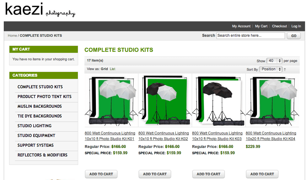
This Kaezi landing page appears impressive – it displays a variety of studio light kits that may pique my interest, and I have the option to click on a specific set for further information. Additionally, there are relevant related categories located in the left-hand navigation bar that I might also find appealing. In general, the design is tidy, and I can easily spot the ‘add to cart’ buttons, which are positioned above the fold.
Grade: B+
Next is the photography lighting kit landing page for Cowboy Studio.
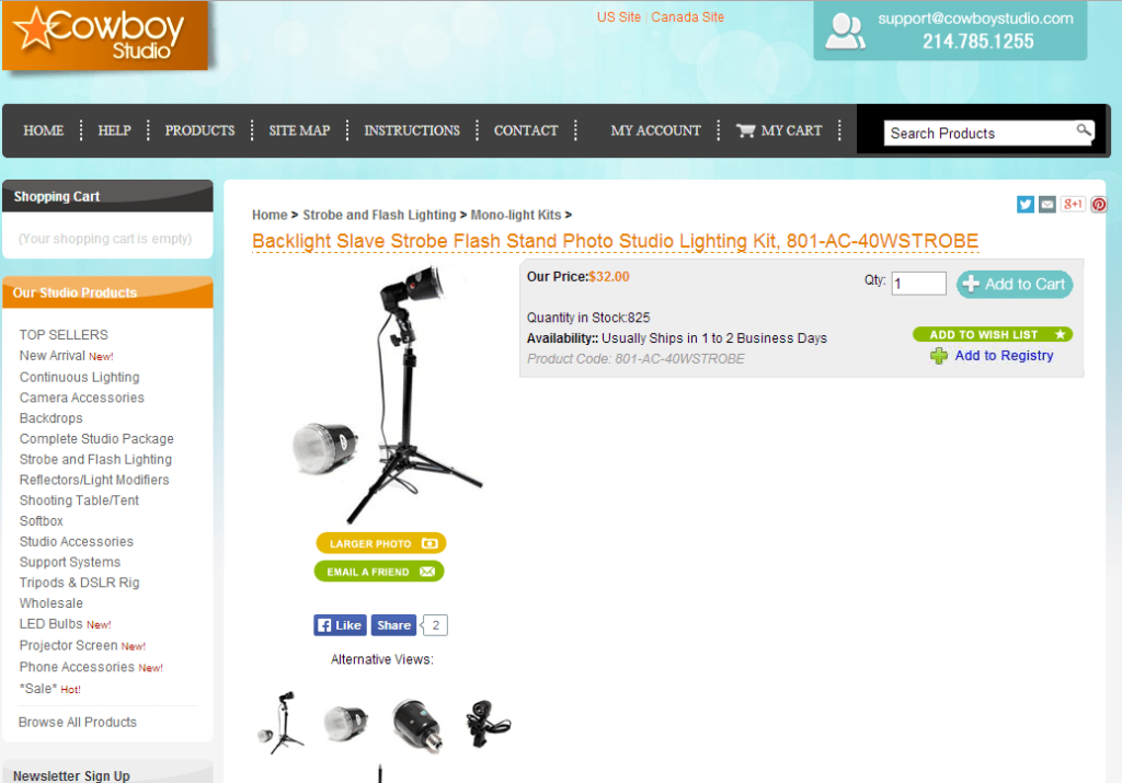
The primary significant issue is the intent – I clicked on an advertisement for photography lighting kits, and this is the result I received. This does not constitute any form of kit – it is merely a single strobe light. As a consumer, I would likely exit this landing page catastrophe and seek a page that better fulfills my requirements.
The intent is completely misaligned, and the layout of this page is chaotic. There is an excessive amount of unused space, with the social sharing buttons and the enlarge photo/email a friend buttons occupying far too much valuable space. The information I truly seek (product details) is positioned far below the fold. This information should be presented in bullet points and placed directly next to the main product image.
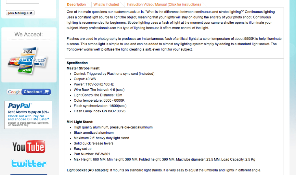
What is truly exasperating is that this website possesses the items I seek – they merely complicate the process of locating them. A bit of wandering through the site enabled me to discover some genuine photography lighting kits, akin to those demonstrated by Kaezi.
The intent is completely misaligned, and the layout of this page is chaotic. There is an excessive amount of unused space, with the social sharing buttons and the enlarge photo/email a friend buttons occupying far too much valuable space. The information I truly seek (product details) is positioned far below the fold. This information should be presented in bullet points and placed directly next to the main product image.
Grade: C-
The landing page was quite poor; however, the situation deteriorated further. Protect your children and spouses, as matters are poised to become exceedingly unpleasant with this example of a “photography lighting kit” landing page from Fovitec.
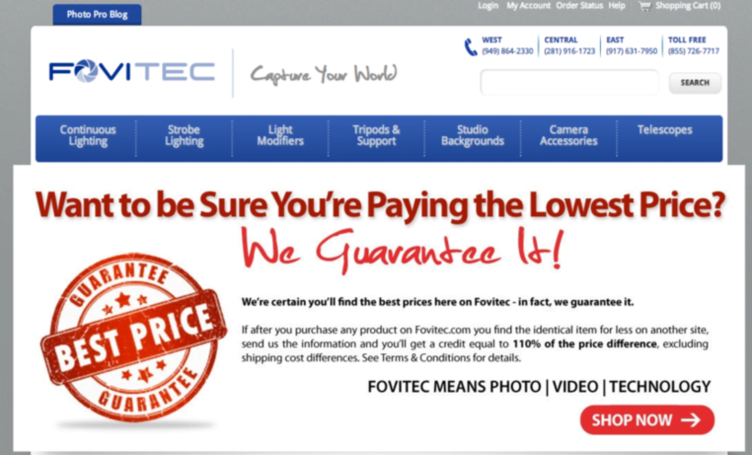
Upon my arrival at this landing page, I find myself utterly disoriented as a visitor. Where exactly am I? I clicked on an advertisement for photography lighting equipment, so why is there nothing that even remotely relates to photography? The only indication that I have not mistakenly clicked on a random pop-up ad is the Fovitec logo, which features an aperture icon in the letter ‘O’ (although the intended camera associations of the term ‘Fovitec’ are completely lost on me).
Even if I were to remain long enough (which the vast majority of visitors will not) to investigate further, none of the navigation links at the top appear to assist me in locating lighting kits. It is crucial to remember: Do not compel your visitors to search for the products you wish them to purchase! Facilitate their conversion process as much as possible. A landing page tool would be beneficial in this context!
Grade: F
Examples of Landing Pages Search #2: “Dog Beds“
Next, we will conduct another Google search, this time for “dog beds,” as we all cherish our dogs and wish for their comfort and coziness.
Orvis presents a commendable dog bed landing page, showcasing a diverse range of dog beds accompanied by an engaging image of a joyful, sleeping dog. The large product images are also visually appealing, and users can filter options by color, feature, shape, fabric, price, and more. Given that “dog beds” is a rather broad search term, this effectively addresses the user’s intent, enabling visitors to explore and discover precisely what they require. (In contrast, had I searched for a more specific query like “large memory foam dog bed,” I would anticipate a landing page that is more tailored.)
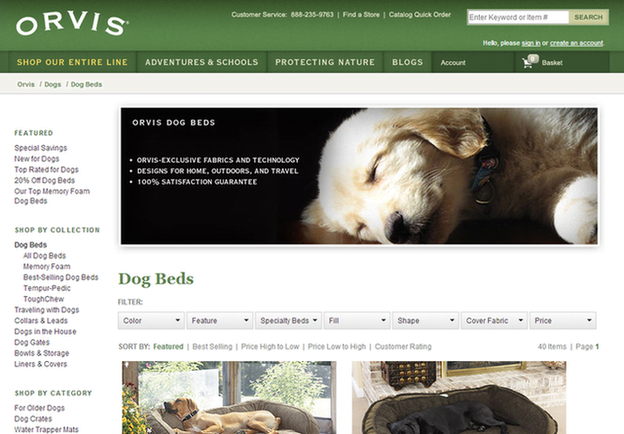
Grade: A-
Next up is Big Barker Beds, a business selling orthopedic dog beds for larger dog breeds.
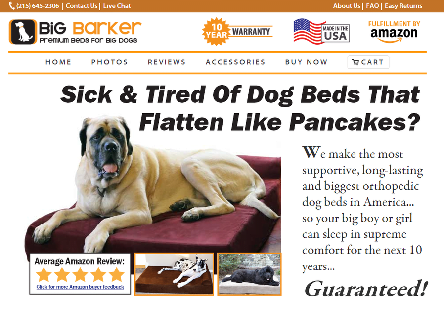
This page presents a challenge as it excels in many areas, yet its shortcomings are quite detrimental. The primary issue with this landing page is its extensive length. It extends for… believe it or not… 38 pages. Indeed, 38 pages, due to the oversized text. While there is some truly excellent content included, it becomes obscured by the overwhelming amount of information.
The landing page showcases numerous outstanding Amazon reviews, and although I appreciate the use of the red underline to emphasize important points, there are far too many reviews (over 40). To be fair, this landing page concerning XL dog beds approaches everything on a grand scale – the text, the reviews, everything. One cannot deny that the page maintains a consistent theme.
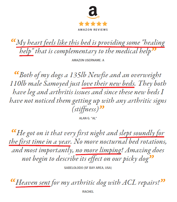
They possess three reviews highlighting the ease of cleaning the bed, seven discussing its suitability for arthritic dogs, and five praising its aesthetic appeal, among others. Remarkably, numerous customers appreciate the product, and it is indeed wise to feature these positive reviews. However, rather than inundating visitors with oversized print, I would suggest including one prominent review that emphasizes the ease of cleaning the beds, another that focuses on their benefits for arthritic dogs, and so forth. Visitors are already aware that these beds boast a five-star rating on Amazon, which serves as an effective trust signal to display prominently. If prospective buyers wish to explore additional customer reviews, they can navigate to the Amazon page. Including every outstanding review on your site may only serve to overwhelm web visitors.
Although the trust signals positioned at the top are beneficial, the initial segment of text beneath the headline could be significantly more conducive to scanning.
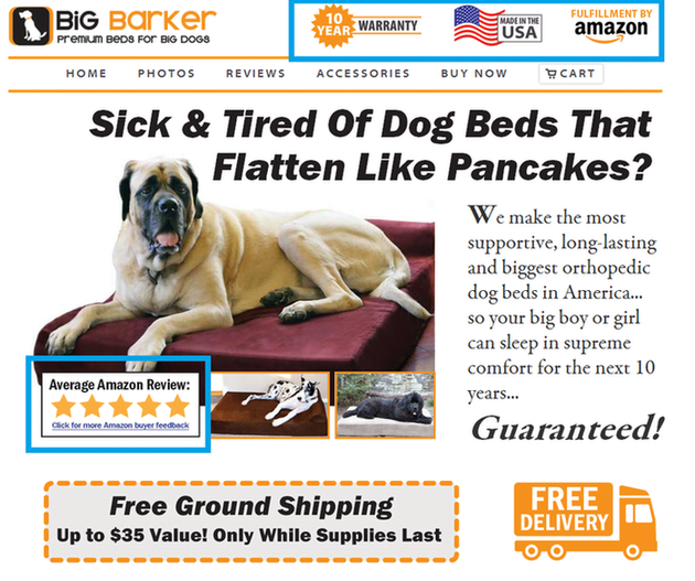
The bulleted information that appears when scrolling down should ideally be positioned above the fold, where it can be more beneficial and offer visitors a clearer overview of the dog beds.
This page contains valuable information regarding the recommendation of this type of bed for older, arthritic dogs, which I found particularly intriguing as the owner of a senior dog. However, much of this excellent content tends to be obscured due to the overwhelming amount of information present on the page.
A straightforward reorganization of the content, along with adjustments to the text size, could significantly enhance the effectiveness of this landing page. (Note: I am unaware of the company’s conversion rate, so it is conceivable that all the text located below the fold may indeed contribute positively to the page’s performance. Unusual outcomes have been observed in A/B testing.)
Grade: B
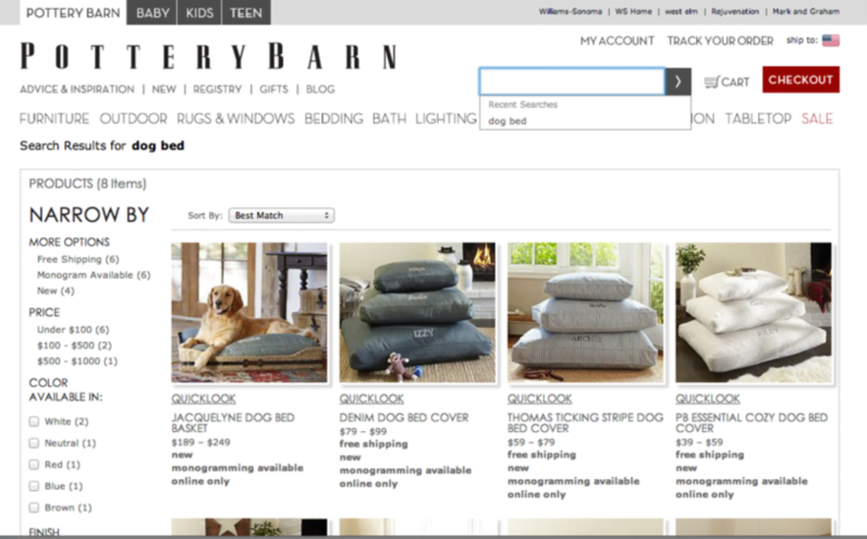
Next in line is Pottery Barn. The landing page for Pottery Barn’s “dog beds” receives a significant failure – clicking on their dog bed advertisement directs me to a landing page for decorative accessories. I observe pillows, blankets, and slipcovers, yet there is no content related to dogs.
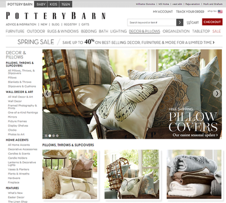
It is quite amusing that after utilizing the site search tool to look for dog beds, I discovered that Pottery Barn indeed provides dog beds. Therefore, why did my landing page not resemble this more closely?
Pottery Barn undoubtedly possesses a substantial advertising budget; therefore, why is there such a lack of attention to detail regarding their landing pages? This represents a significant missed opportunity for Pottery Barn. The Pottery Barn brand is widely recognized and enjoys a strong customer base – I am confident that numerous consumers would prefer PB dog beds over competing options. However, directing PPC clicks to an incorrect landing page is effectively wasting potential sales.
Grade: F
Examples of Landing Pages Search #3: “Silk Flowers“
Let us examine the landing page examples that appear when we search Google for “silk flowers.”
This landing page begins with a prominent flyer highlighting the various impressive crafts that can be created using silk flowers
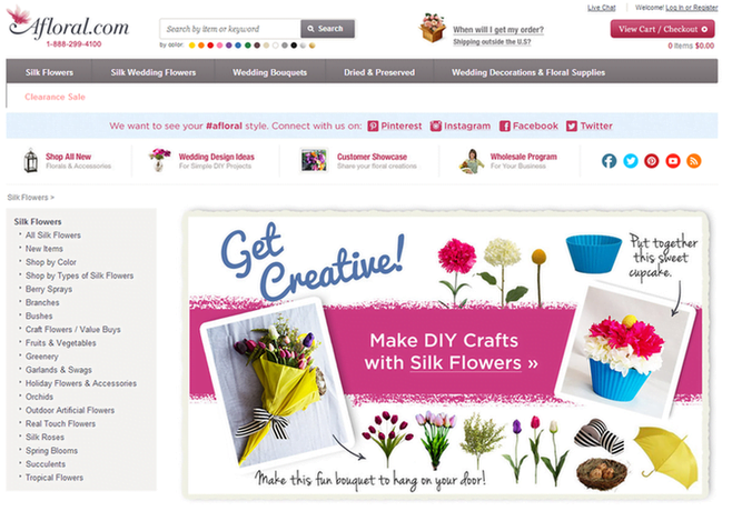
That is interesting… I suppose. In truth, I already had a concept in mind and merely wish to examine the flowers. They are located below the fold, assembled in a disorganized fashion.
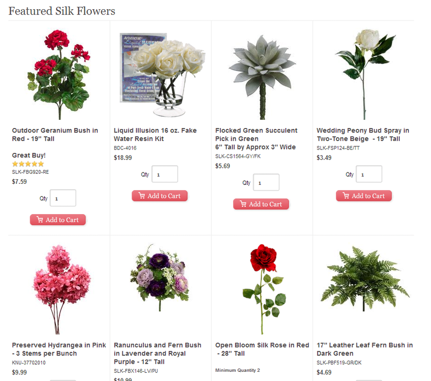
It is noteworthy that when I click on the flyer regarding the DIY crafts I can create using silk flowers, I am directed to this page.
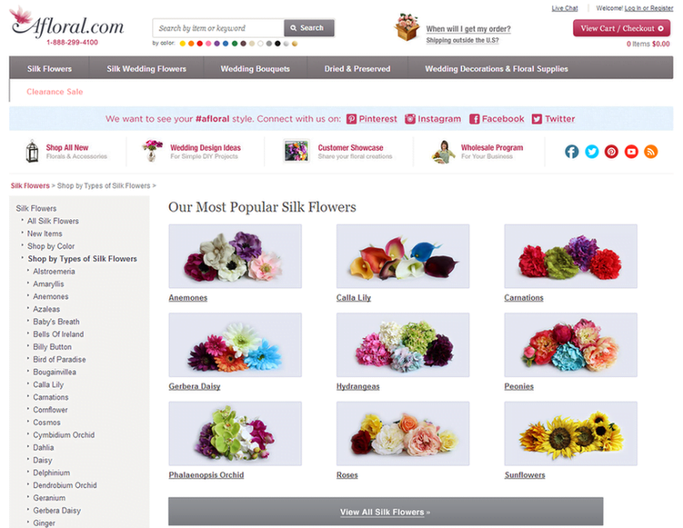
Greetings, you are currently viewing the most desired silk flowers! This landing page is considerably better than the one I was initially directed to. Here, we are offered a varied selection of silk flowers categorized by name, along with vibrant and colorful images. This landing page is praiseworthy – it would have been perfect for my initial inquiry regarding “silk flowers.” However, to reach this page, I had to click on a link that discussed DIY silk flower crafts. I do not see any crafting information here. It seems that this website genuinely needs to focus on user intent and contemplate the direction it wishes to lead its visitors
Grade: C+
Our next silk flower landing page example comes from eFavorMart.
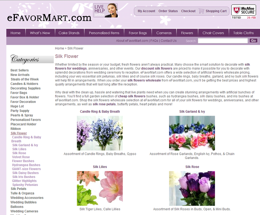
This landing page is yet another unappealing example that evokes the early 2000s. It fails to effectively utilize its headings, and the dull, extensive (and small-font) text is filled with blatant instances of keyword stuffing. Consequently, this page appears spammy and undermines any trust the brand may have built (and indeed, any website that begins with a lowercase ‘e’ or ‘i inherently raises doubts).
Grade: C
Examples of Landing Pages Search #4: “Email Marketing Software“
Let us examine the landing pages that appear in a Google search for “email marketing software.”
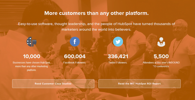
Hubspot is prominently featured at the forefront, which is not particularly surprising. However, their landing page does not utilize compelling imagery to capture the visitor’s interest, opting instead to highlight its notable awards and recognitions.
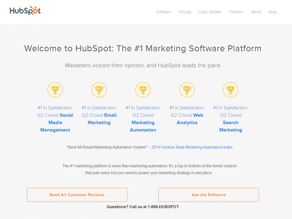
Numerous other landing pages face challenges in capturing and streamlining their content, whereas this Hubspot landing page is direct and concise. Additionally, there is more persuasive text featuring social trust indicators and customer testimonials further down the page:
This serves as a strong example of a landing page; however, it could benefit from some refinements. I recommend experimenting with the button colors. Currently, the buttons blend in with the background, featuring only a faint orange outline, which makes them less appealing to click. Generally, higher contrast is preferable. Additionally, the first section above the fold seems to lack vibrancy and enthusiasm, and it could be enhanced with more color or visual interest.
Grade: B+
Next up is Zoho Campaigns. Zoho also has a strong landing page designthat could benefit from a few adjustments.
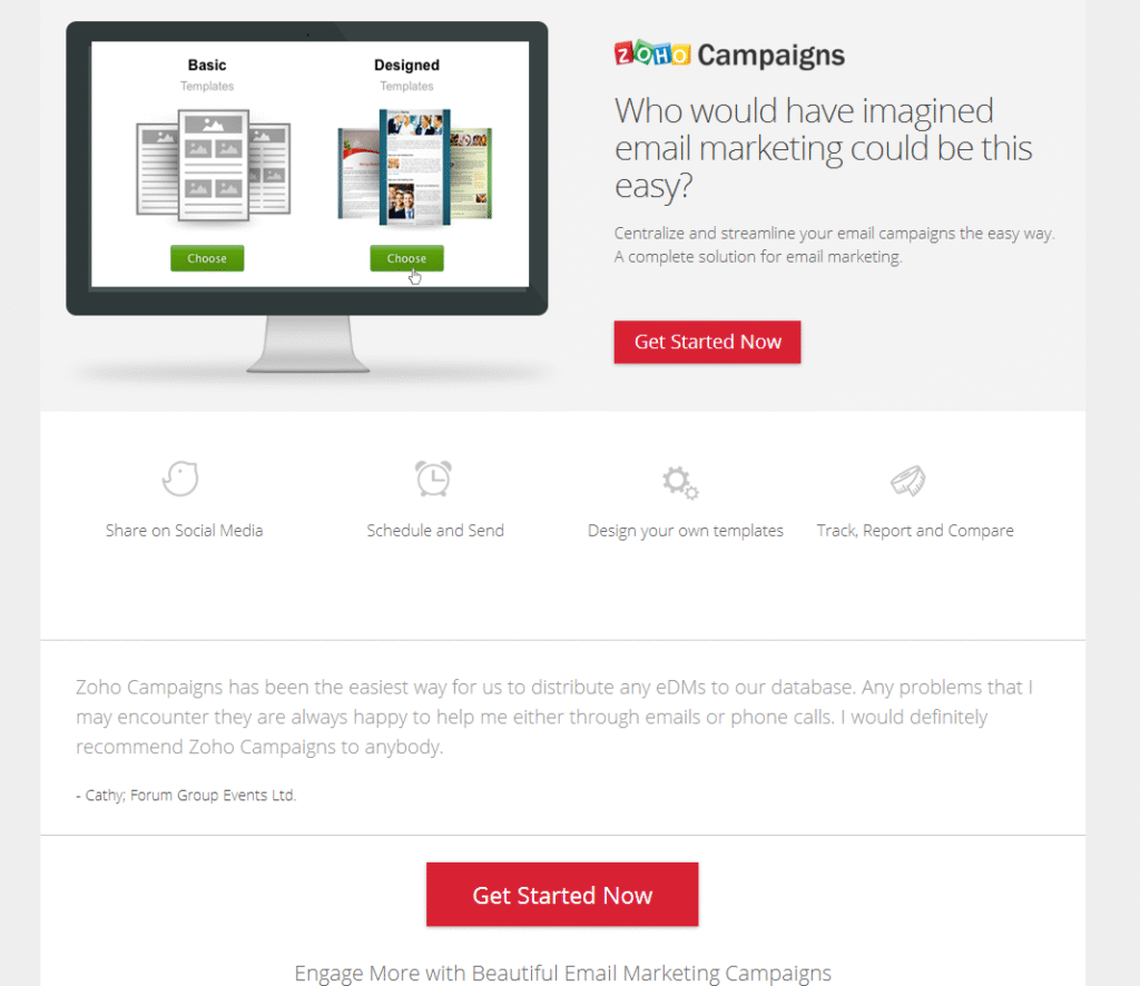
Many of my critiques are minor and may appear trivial; however, truly effective landing pages necessitate a level of precision and perfection akin to scientific standards. The heading for Zoho should ideally be condensed to fit within two lines rather than three. The primary image is somewhat perplexing – does it represent the product itself, or are we meant to focus on the vibrantly designed templates that Zoho provides in contrast to the dull and uninspiring templates from other companies? The intention is unclear – selecting a different image could significantly enhance this landing page.
Although I appreciate the small icons that illustrate the essential elements of Zoho campaigns, the colors used are somewhat too pale. Typically, shades of grey text are preferred over black, which is commonly employed to indicate focus (darker text signifies greater importance). These icons should attract more attention, as they convey the primary advantages of Zoho. Additionally, there is a slight excess of white space. If I were to choose between a landing page that is overly cluttered or one that is excessively spaced out, I would certainly opt for the latter. Nevertheless, incorporating a second testimonial or an additional line of feature icons could be beneficial while still preserving a sleek and appealing design.
Although having a customer recommendation is beneficial, it might be preferable to select a recommendation from a more well-known brand or client (and include their logo in the testimonial). Of course, if Cathy from Forum Group Events Ltd. is indeed their top client, then that is acceptable (no offense intended, Cathy; it is nothing personal).
Grade: B
Next, we will examine SAP. My goodness, this landing page is quite unattractive. It resembles a resources page more than a product landing page (and a rather unappealing resources section at that). I clicked on an advertisement for “email marketing software,” yet the term “email” is completely absent.
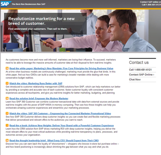
It is unfortunate because I do not doubt that some of this content holds value; it is commendable that SAP is making an effort to produce original and useful content for visitors. However, this is neither the appropriate time nor the suitable venue for it. A thorough brainstorming session focused on visitor intent is urgently needed in this context.
Grade: D
Our final example of a landing page comes from Infusionsoft marketing software.
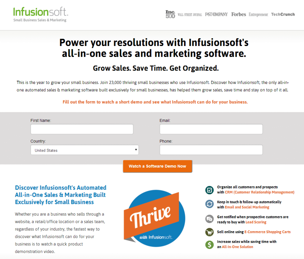
This landing page is quality stuff.
The headings and text are appropriately selected and positioned, utilizing color variations to signify the importance of different sections. The colored icons on the right effectively capture the visitor’s attention towards the primary benefits provided by the product. The trust indicators located in the upper right corner are subtle yet prominent. The color and text of the button are suitable, and I appreciate how the centrally located form engages the visitor.
A few things I would change:
I may contemplate relocating the testimonials currently positioned below the fold to a higher placement and replacing the text segment in the bottom left corner; however, it is not a critical issue.
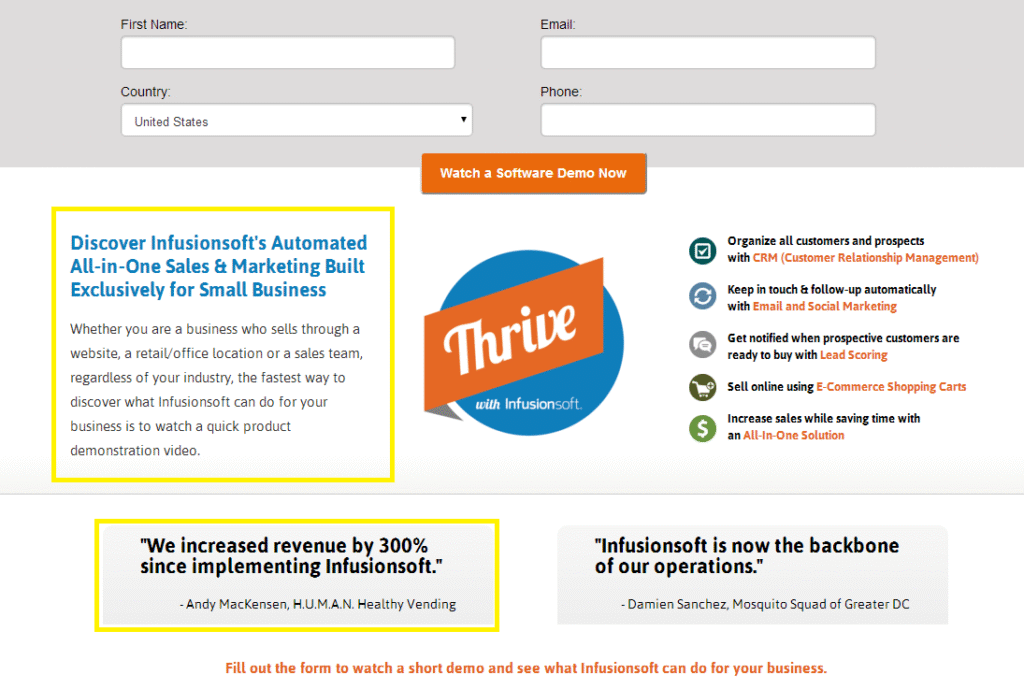
I am slightly annoyed that the first name input field does not align with the one beneath it, and that the button is not perfectly centered between the form fields; however, these are simple adjustments. I consider a free trial offer to be a more compelling incentive than a demo, although Infusionsoft may have considerable success with their demo – each organization possesses its own set of testing research that can affect specific aspects of their landing page. Keep in mind that you are most familiar with your company, and not all general best practices for landing pages may apply to your situation.
I think this may be my favorite among all the landing page examples we have examined.
Grade: A+
Do you agree with my grading? What grades would you give?
Examples of Landing Page Design: Innovation Compared to Best Practices
Let us proceed to examine some of the innovative landing page designs that various companies are currently exploring. In a previous blog post regarding exceptional landing page designs, we discussed the recommended best practices for achieving an optimal landing page. Nevertheless, numerous sites are willing to compromise landing page standards in the name of experimentation.
One emerging trend in landing page design involves eliminating nearly all text and instead depending solely on large, high-quality images to convey the page’s concept or product.
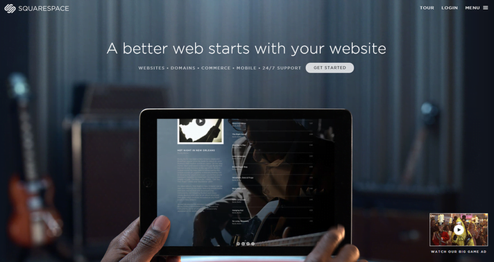
Square Space occupies the entire landing page with a single, enormous image. This approach is somewhat risky, as it is not entirely evident how Square space intends to enhance my website. Are they assisting with design? Site management? Square Space is garnering enough attention these days that they may be relying on the assumption that visitors are already familiar with their offerings. While some may consider this a precarious assumption, the design is undoubtedly captivating.
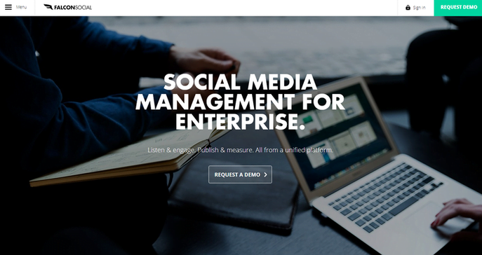
Falcon Social, a software for managing social media, features a landing page that closely resembles that of Square Space, including the color palette. Unlike Square Space, Falcon Social omits the somewhat philosophical tagline and directly addresses its purpose – social media management for enterprises.
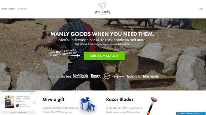
Manpacks also ventures into the realm of image-centric strategies. The landing page focuses on a prominent image while still adhering to conventional landing page practices, including testimonials and trust indicators.
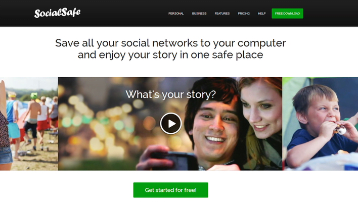
Social Safe employs an image-focused strategy, incorporating a video element as well. (Further details on video landing pages can be found here.) However, the value proposition of Social Safe remains somewhat ambiguous – what is the rationale behind “saving” all my social networks to my computer? What does this entail? Additional clarification is required, which underscores the importance of the explainer video. The critical question is whether visitors will remain engaged long enough to view the video for a clearer understanding, or if they will seek out an alternative landing page that succinctly outlines the advantages in a user-friendly format.
We trust that this exploration of landing page examples and designs has enhanced your comprehension of the elements that constitute an effective landing page and has inspired you with ideas on how to construct and progressively refine your landing page.
Have you observed any emerging trends in landing pages that you find appealing or unappealing? What are your thoughts on our landing page examples? Do you have any memorable experiences, either positive or negative, related to landing pages? We welcome your feedback in the comments!
Examples of UX/UI: The Best and the Worst in Action
Having examined landing page design, we shall now shift our focus to User Experience (UX) and User Interface (UI) – two vital components that can significantly influence a visitor’s engagement with your website.
While UI emphasizes the visual components—the arrangement, color schemes, typography, and buttons—UX prioritizes usability, clarity, ease of navigation, and the intuitiveness of the overall experience. Let us investigate practical examples of websites, one that exemplifies excellence, and another that falters in critical aspects.
UX/UI Example #1: Best – Cinch PR
The Cinch PR website exemplifies sophisticated, user-centered design.
Upon loading the page, one is greeted by a minimalist interface complemented by vibrant, high-quality visuals. The homepage effectively conveys professionalism and clarity, ensuring that visitors are not overwhelmed. The brand’s tone—refined, innovative, and contemporary—is consistently represented throughout the user interface.
Navigation is straightforward and intuitive, featuring a sleek top-bar menu that subtly animates as one scrolls. Sections are well-proportioned, and the typography is legible, preserving a clear hierarchy. Each page transitions seamlessly, and there is a strong sense of visual coherence in the color scheme, iconography, and photographic style.
What is particularly noteworthy is the deliberate storytelling—the layout naturally guides the viewer’s attention from the headline to the image and then to the call to action. This creates a polished digital experience that is free of friction.
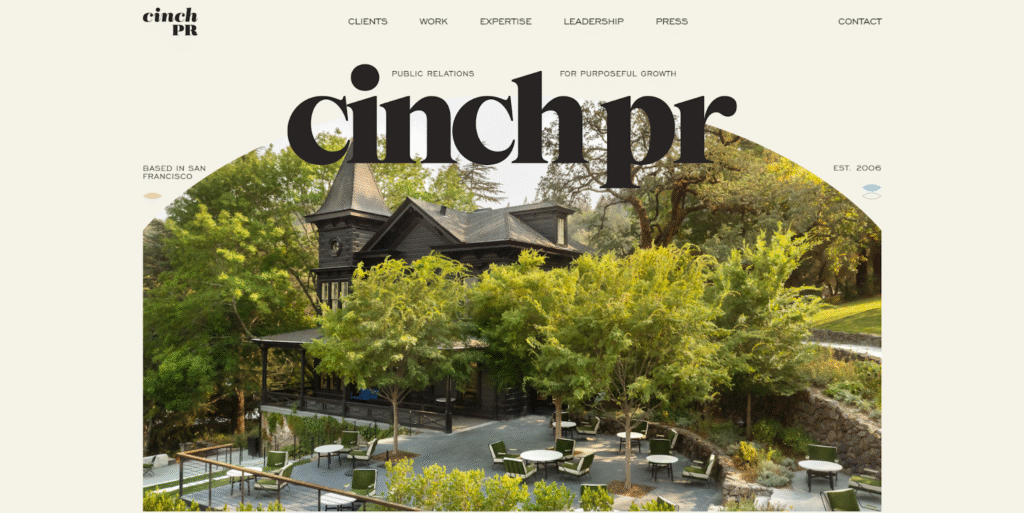
This site demonstrates how an agency can showcase its creative strength without sacrificing usability. It’s not just beautiful—it’s effective.
Grade: A
UX/UI Example #2: Worst – Discount Beds Belfast
Regrettably, the Discount Beds Belfast website does not meet expectations in terms of both user interface (UI) and user experience (UX).
At first glance, the homepage appears outdated and cluttered, featuring inconsistent font sizes, pixelated images, and an absence of a contemporary layout structure. The navigation is perplexing, particularly on mobile devices, where dropdown menus overlap, and locating product categories proves challenging. The visual hierarchy is inadequate, making it hard for visitors to determine where to concentrate their attention or how to navigate further.
There is no evident call-to-action positioned above the fold, and the homepage lacks visual attractiveness. Product pages, which ought to be the focal point of the site, are burdened with small text and generic descriptions that do not effectively emphasize key selling points. Additionally, images are poorly optimized, which significantly undermines both user trust and the overall aesthetic appeal.
While the site does offer valuable content and genuinely competitive products, the subpar UI and frustrating navigation experience hinder visitors from engaging or converting
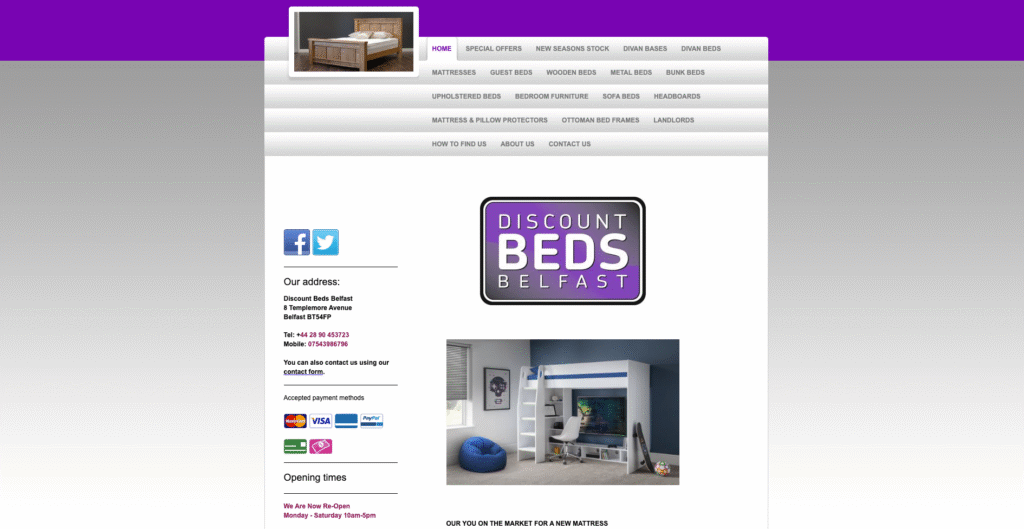
This is a classic example of how outdated design and poor usability can directly impact business performance.
UX/UI Takeaway
These instances underscore a fundamental reality: while UI draws users in, it is UX that maintains their interest. Whether you are creating a corporate website or a personal portfolio, the most effective designs harmonize aesthetics with functionality.
Cinch PR exemplifies this equilibrium, offering sleek, contemporary visuals paired with user-friendly interactions. Conversely, Discount Beds Belfast illustrates the importance of both functionality and initial impressions, particularly in highly competitive markets.
Have you encountered a website that either captivated or annoyed you? We invite you to share your opinions in the comments—we are eager to hear from you!